Workflow Orchestrator UI
The default Workflow Orchestrator UI app should offer sufficient functionality to start working with, and experiencing, the workflow orchestrator. For this an example-orchestrator-ui is available to start working with a ready to deploy example workflow orchestrator backend.
At the same time the UI is developed with the concept in mind that any user of the workflow orchestrator can customize the UI to meet their own requirements. There are two possible ways to accomplish this:
- Overriding components
- Using components from the npm UI library
Overriding components
The first solution is based on using the orchestrator-ui library in its full extend and just add/tweak components. Examples of this approach would be:
- render certain resource type differently then the npm normally does
- add menu items to the navigation
- add summary cards to the dashboard page
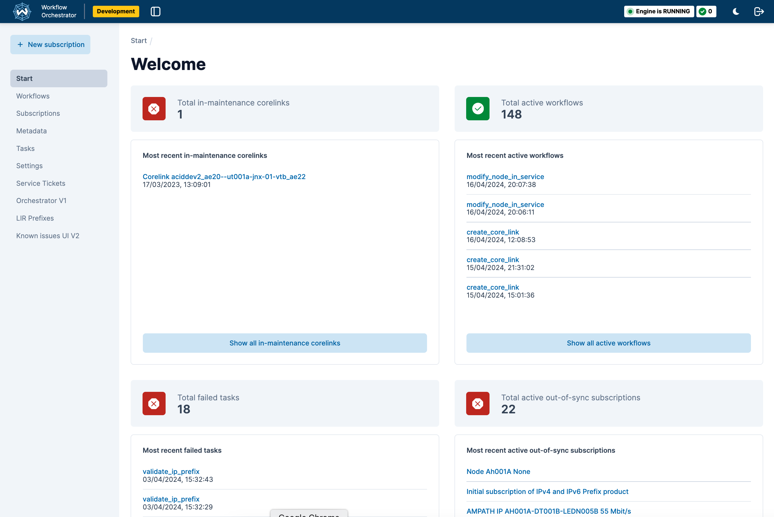
An example of a custom orchestrator-ui is shown below, which shows a custom summary card and additional menu items compared to the standard orchestrator-ui.
Using components from the npm UI library
The second solution will probably require more work, but could be interesting to extend an existing application with orchestrator components.
Both customization solutions rely on the npm package of the components library published in npm. This package contains the pages and components that are meant to be used in an app that serves the frontend to a workflow orchestrator backend.
To have a development setup where both the source code of the app and the source code of this package are available
have a look at the
Orchestrator UI library repository at the location
packages/orchestrator-ui.
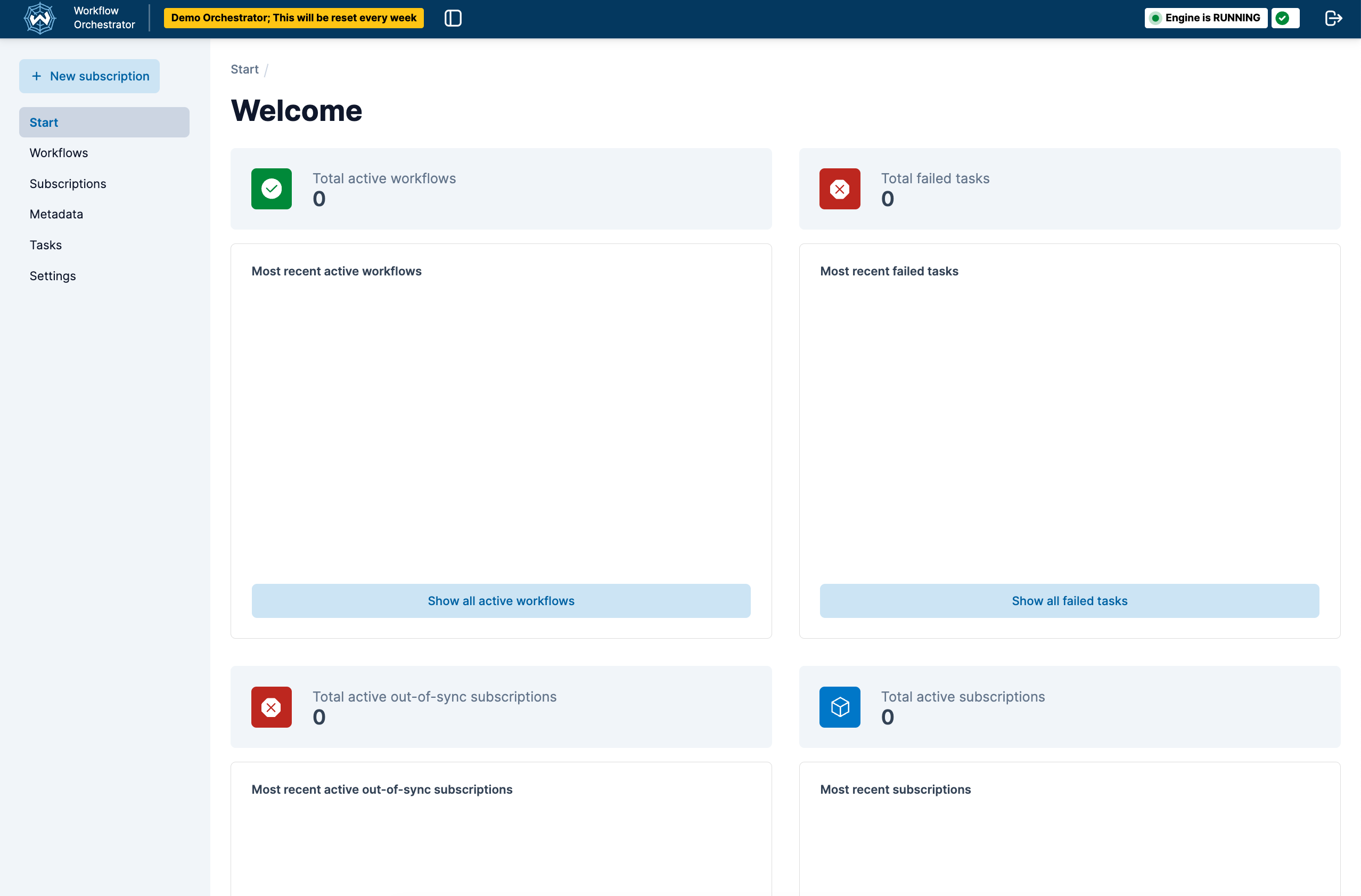
Example screenshots of orchestrator-ui
Standard orchestrator-ui
Custom orchestrator-ui
- showing additional summary card component (in-maintenance core link)
- additional menu items
Env variables
The env variables from .env.example are meant to work with an example workflow orchestrator backend. They can be changed as needed. At the moment of writing, variable available are:
ENVIRONMENT_NAME: “Development”, “Production”, or anything in between.ORCHESTRATOR_API_HOST(string): The base url of the workflow orchestrator engine.ORCHESTRATOR_API_PATH(string): The path to the api from the base url.ORCHESTRATOR_GRAPHQL_HOST(string): The base url to the graphql server.ORCHESTRATOR_GRAPHQL_PATH(string): The path to the graphql endpoint.ORCHESTRATOR_WEBSOCKET_URL(string): The url to the websocket server that emits cache invalidation events.AUTH_ACTIVE(Boolean): If authorization is active or not.USE_WEBSOCKET(Boolean): Establishes a websocket connection that allows the backend to send cache key invalidation messages to let the frontend now something has changed on the backend.USE_THEME_TOGGLE(Boolean): Show a toggle that allows a user to switch from light to dark theme and back.SHOW_WORKFLOW_INFORMATION_LINK(Boolean): Show a information icon on the workflow detail pages that allows for linking to an external documentation system.WORKFLOW_INFORMATION_LINK_URL(string): The url used to build the url that the information icon links to. The format of the link is:<WORKFLOW_INFORMATION_LINK_URL><WORKFLOW_NAME>. The contents at this url should be maintained in the external documentation system.
An up-to-date definition can be found in the code repository
in the object defined as OrchestratorConfig.
Starting a workflow from the orchestrator UI - User input forms
Creating a Workflow orchestrator workflow is explained here: Creating a workflow.
Once a workflow is created it will - automatically - show up in the dropdown list that opens from + New Subscription.
When selected a request will be made to the
The example UI contains an example form that shows an example of a form definition and the form it renders at
http://localhost:3000/example-form.
Deployment to other environments
For deployments to your own environment it’s recommended to copy or fork the code of the Example orchestrator UI repository into your own code repository, add your customization and configuration and deploy from there.
Extensibility:
The Orchestrator UI allows for a number of customization options:
Adding extra pages
The Orchestrator UI is based on NextJs and its pages router. Files that are added to the pages folder are
automatically rendered at the URL <url>/<filename>. For example a file a the location pages/cats.tsx will cause the
contents of the file to be rendered at the location http://localhost/cats.
Please note the pages routes is deprecated by NextJS and might be replaced by the newer app router.
Adding menu items
The file pages/_app.tsx contains the rendering of WfoPageTemplate component. This component takes a callback called
overrideMenuItems which receives the current menu items and can alter them.
<WfoPageTemplate
    overrideMenuItems={
        (currentMenuItems) => {
            return [
                ...currentMenuItems,
                { custom_menu_items }
            ]
        }
    }
>
Adding a custom logo
The file pages/_app.tsx contains the rendering of WfoPageTemplate component. This component takes a callback called
getAppLogo. The React component that is returned by this function gets displayed as the app logo.
<WfoPageTemplate
    appLogo={() => {
        return <div>LOGO</div>
    }}
>
Authorization and RBAC
The Orchestrator UI library provides a standard isAllowed handler that wraps certain components and can be used to wrap pages. The default behaviour is to always return true allowing everything inside it to show. By providing a custom implementation you can implement your own rules for allowing or disallowing things.
<WfoAuth isAllowedHandler={(routerPath: string, resource?: string) => {... custom rules ... }}>
    <EuiProvider
        colorMode={themeMode}
        modify={defaultOrchestratorTheme}
    >
    ....
    </EuiProvider>
</WfoAuth>
Overriding fields, sections and start page content
Field values are displayed as plain strings by default and the sections on a page have a set order. For some fields and
sections you might want more control, this is made possible by supplying a orchestratorComponentOverride object to the
StoreProvider in _app.tsx. Currently this is possible for the subscription detail and the start page only.
The orchestratorComponentOverride has these options
<StoreProvider
    orchestratorComponentOverride={
        startPage?: {
            summaryCardConfigurationOverride?:
                defaultItems: ReactElement[],
            ) => ReactElement[];
        };
        subscriptionDetail?: {
            valueOverrides?: Record<string, (fieldValue: FieldValue) => ReactNode>;
            generalSectionConfigurationOverride?: (
                defaultSections: WfoSubscriptionDetailGeneralConfiguration[],
                subscriptionDetail: SubscriptionDetail,
            ) => WfoSubscriptionDetailGeneralConfiguration[];
        };
    }
>
Available functions
startpage: summaryCardConfigurationOverride: A function that gets the default items as input and should return a new list of items
subscriptionsDetail: valueOverrides: A function that should supply a field name to function mapping where the function will be called with the field value when the field is rendered.
subscriptionDetail: generalSectionConfigurationOverride: A function that receives the default sections and the subscription detail object and returns a new list of sections
Component library
The repository that publishes the npm package that is used to supply the layout components is Orchestrator UI Component library. Next to pages it exports page components that can be used to build custom pages.
Theming
Customizing the theme
The Workflow Orchestrator frontend ships with a default theme leveraging the theming mechanism of Elastic UI. This theme can be partially adjusted or completely overridden.
As part of the boilerplate code, the _app.tsx file applies a defaultOrchestratorTheme object to the EuiProvider.
<SeveralProviders>
  <EuiProvider colorMode={themeMode} modify={defaultOrchestratorTheme}>
    ...
  </EuiProvider>
</SeveralProviders>
The default defaultOrchestratorTheme object contains adjustments of the standard theme provided by Elastic UI and can be imported from the @orchestrator-ui/orchestrator-ui-components package.
To make small adjustments, simply use
defaultOrchestratorTheme
as a base and override the desired properties:
import { EuiThemeModifications } from '@elastic/eui';
import { defaultOrchestratorTheme } from '@orchestrator-ui/orchestrator-ui-components';

function CustomApp(...) {
    const myTheme: EuiThemeModifications = {
        ...defaultOrchestratorTheme,
        colors: {
            DARK: {
                primary: '#FF69B4',
            },
            LIGHT: {
                primary: '#32CD32',
            },
        },
    };

    return (
        <SeveralProviders>
            <EuiProvider
                colorMode={themeMode}
                modify={myTheme}
            >
                ...
            </EuiProvider>
        </SeveralProviders>
    )
}
The usage of defaultOrchestratorTheme is not required, a new EuiThemeModifications can also be made from scratch or
using the helper tool on the EUI website.
Color Mode
The color property of the theme object contains a DARK and LIGHT object representing the color mode. The
_app.tsx file contains a mechanism to switch and store the color mode. In any given component the
useOrchestratorTheme hook can be used to get the current color mode. For more convenience, there is also the
isDarkThemeActive boolean:
import { useOrchestratorTheme } from '@orchestrator-ui/orchestrator-ui-components';

const WfoAnyComponent: FC<WfoAnyComponentProps> = (...) => {
    const {
        colorMode,          // type: EuiThemeColorModeStandard
        isDarkThemeActive   // type: boolean
    } = useOrchestratorTheme();

    return(...);
}